
Personal Identity Package
Here is my Personal Identity Package that I created. This Personal Identity Package was created to establish a brand for myself to implement throughout any promotional material for myself. The main application of this branding was with the Intern Showcase at Dunwoody College of Technology to show off my skills and specialties to potential employers.
This Identity Package includes: logo concepts, portfolio layout, business cards, resume, letter head, poster, and a thank you card. I'll take you through the process of concepting and creating the entire package.
Logo Creation
In these initial concepts I implimented the geometric style and explored and optical illusion-like effect with the first logo. I explored different implimentations of geometric shapes as well as positive and negative space.
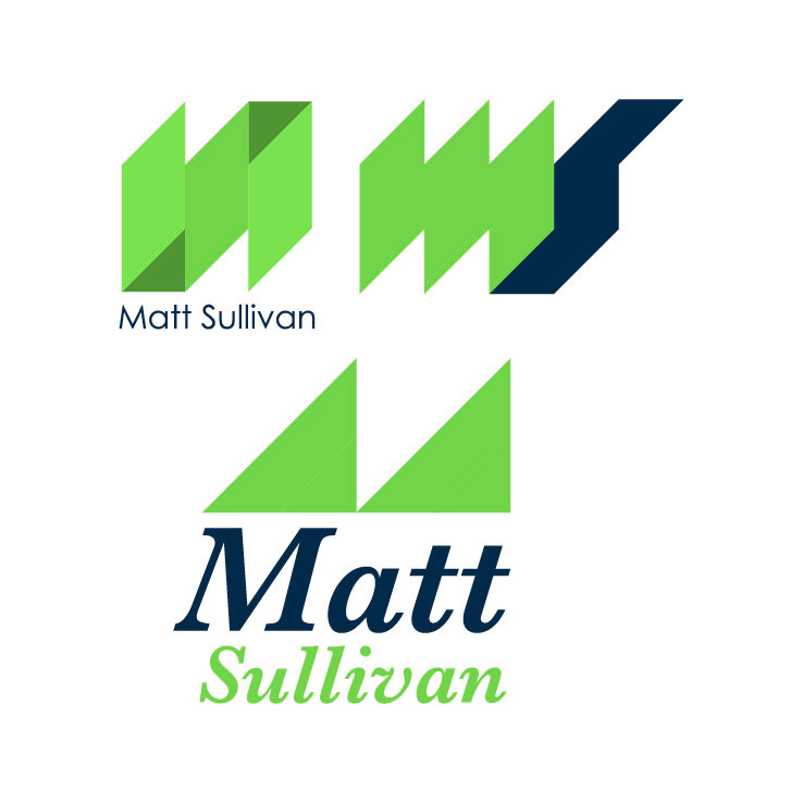
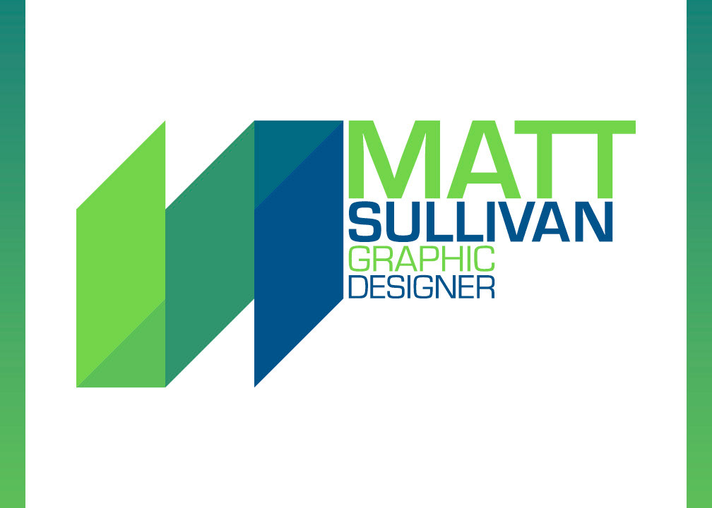
I felt that this logo was the strongest of my concepts, so I took it a little further by changing the colors up to create the effect of dimension and transition from green to blue. This logo also incorporates my initials "M" and "S" in a geometric style.
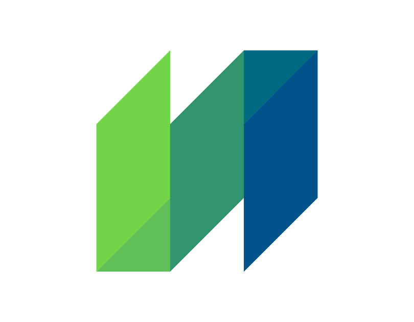
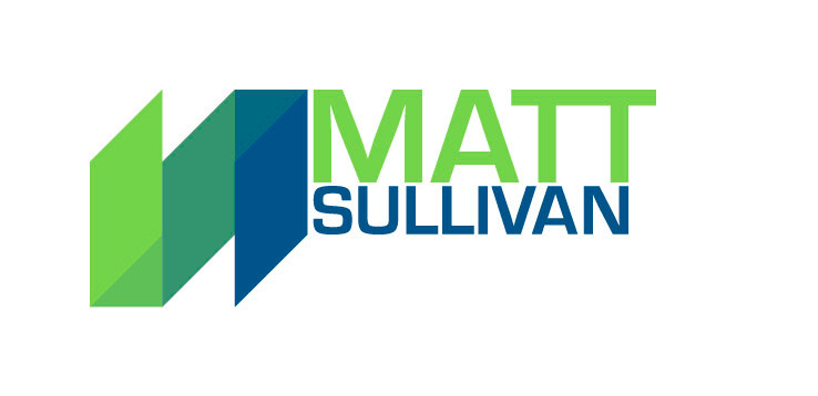
This is the final logo with the final type treatment using the Eurostyle font family. I felt that this font incorporated a geometric style that complimented the logo, but it also has a smooth curviture to it that contrasts the sharp geometric style.
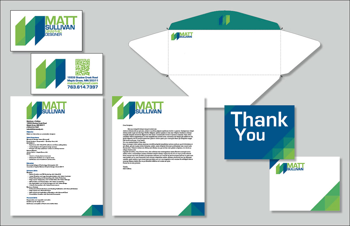
Business Card
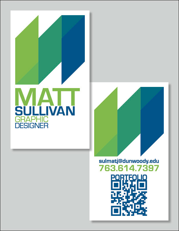
Vertical Format
My first attempt for the front and back of the business card in the vertical format.
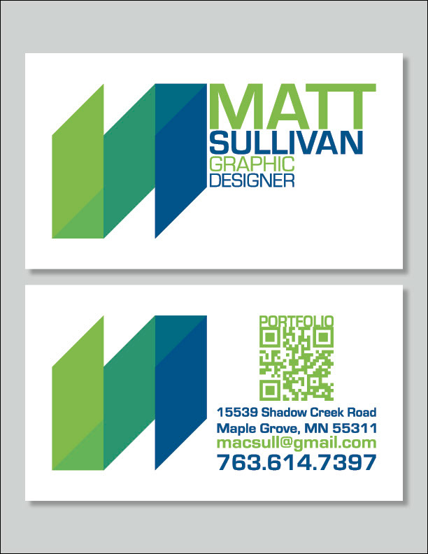
Horizontal Format
My second attempt of the front and back of my business card in the horizontal format.
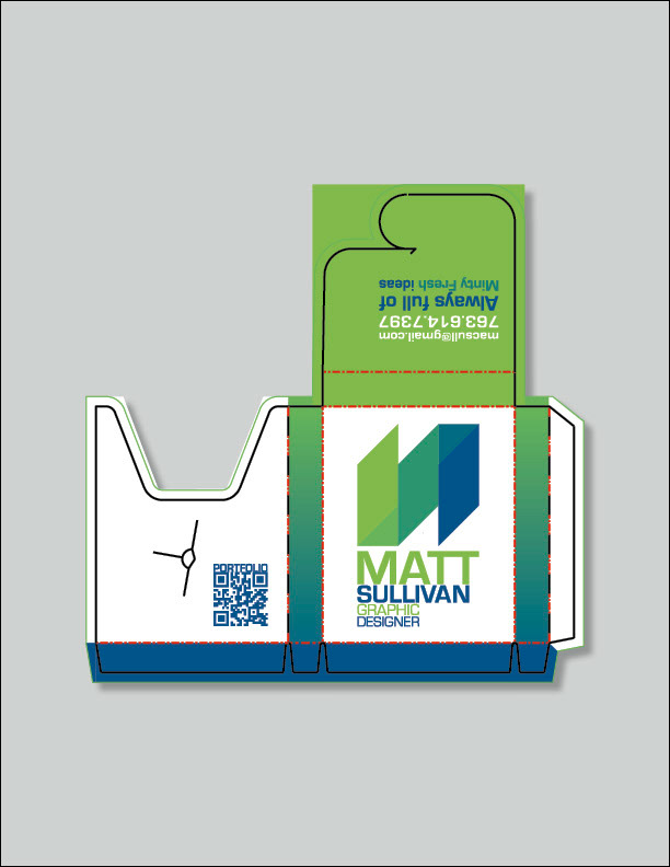
Packe of Gum Business Card
Here's the dieline and artwork with bleed for my pack of gum business card. I came up with this idea while playing around in ArtiosCAD and recreating dielines of packages I found around me. This idea takes the concepts of my business card of being eye-catching and rememberable to the next level.
The dieline and artwork with bleed for the pack of gum.
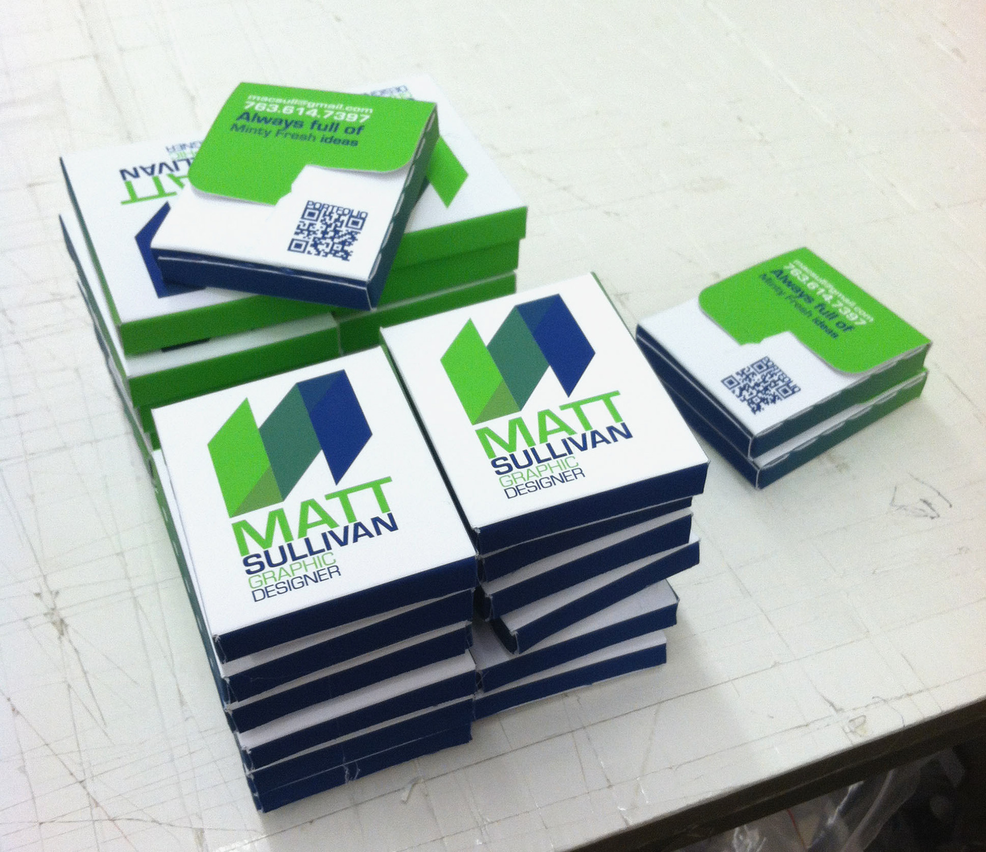
The physical packs of gum business cards. I created 27 total packs to hand out at my Intern Showcase.
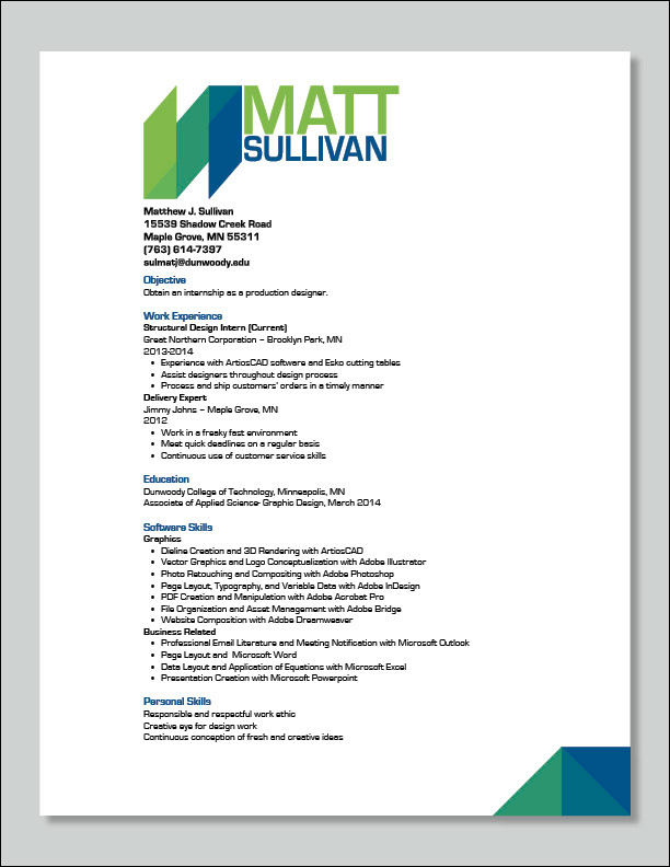
Resume
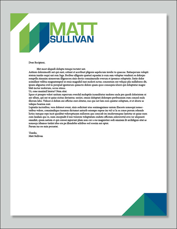
Letter Head
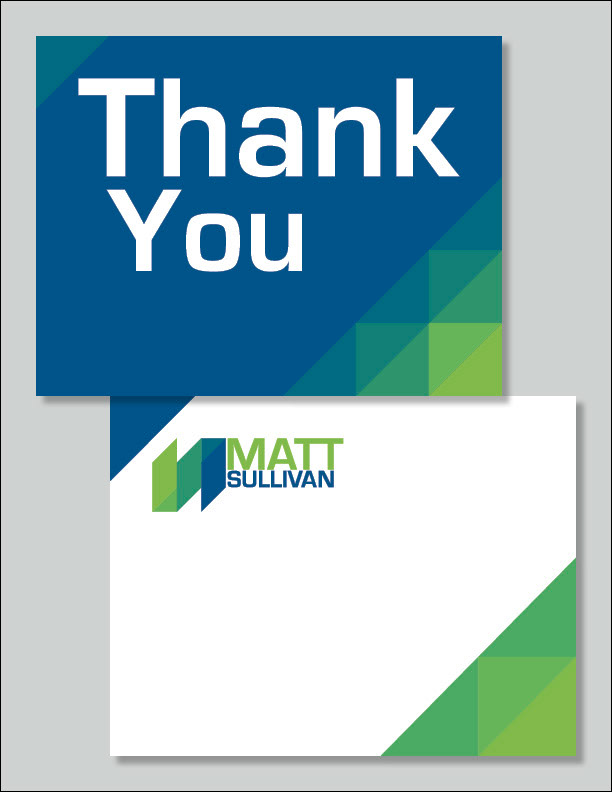
Thank You Card
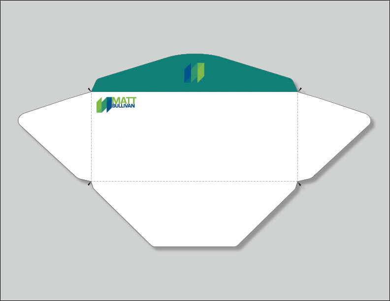
Envelope
Poster

Portfolio Page Layout
This is the page layout for my physical portfolio. This includes a cover page with 6 spreads (13 pages total) and to tie my portfolio to my identity package, I decided to incorporate a bar on the face of the pages. This bar is small enough to not distract the viewers attention from the work in the portolio, but it's big enough to be recognized as something to be tied to my identity package. The flow of the page layout is, starting from the left and moving to the right, sketches and concepts to artwork to final product.
This is the cover page for the portfolio.
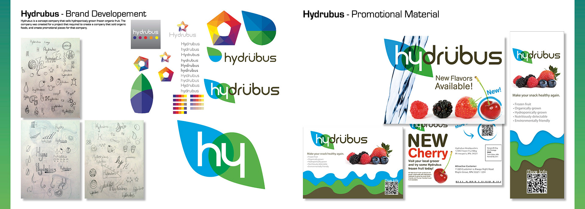
This is the Hydrubus spread for the portfolio. To check out this piece online, click here.
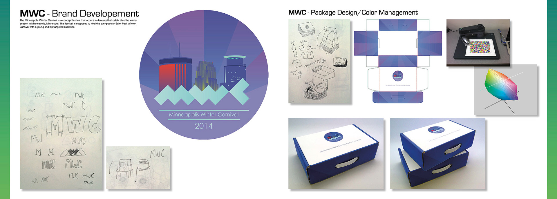
This is the Minneapolis Winter Carnival spread for the portfolio. To check out this piece online, click here.
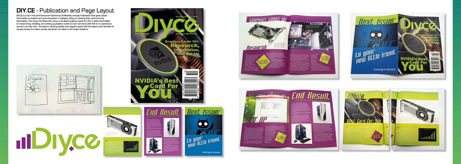
This is the DIY.CE spread for the portfolio. To check out this piece online, click here.
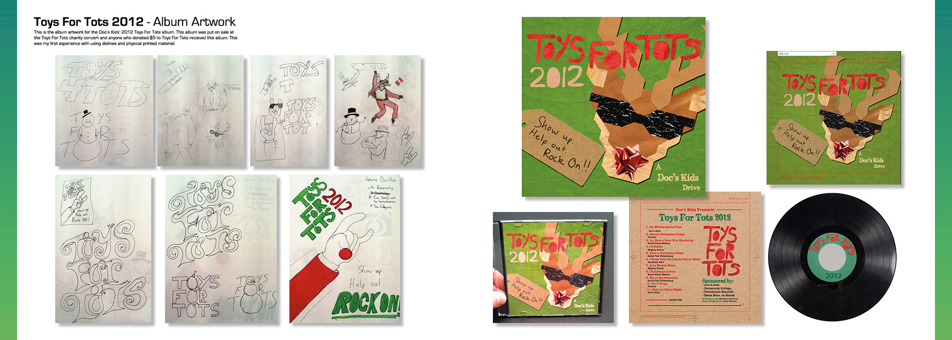
This is the Toys For Tots 2012 spread for the portfolio. To check out this piece online, click here.
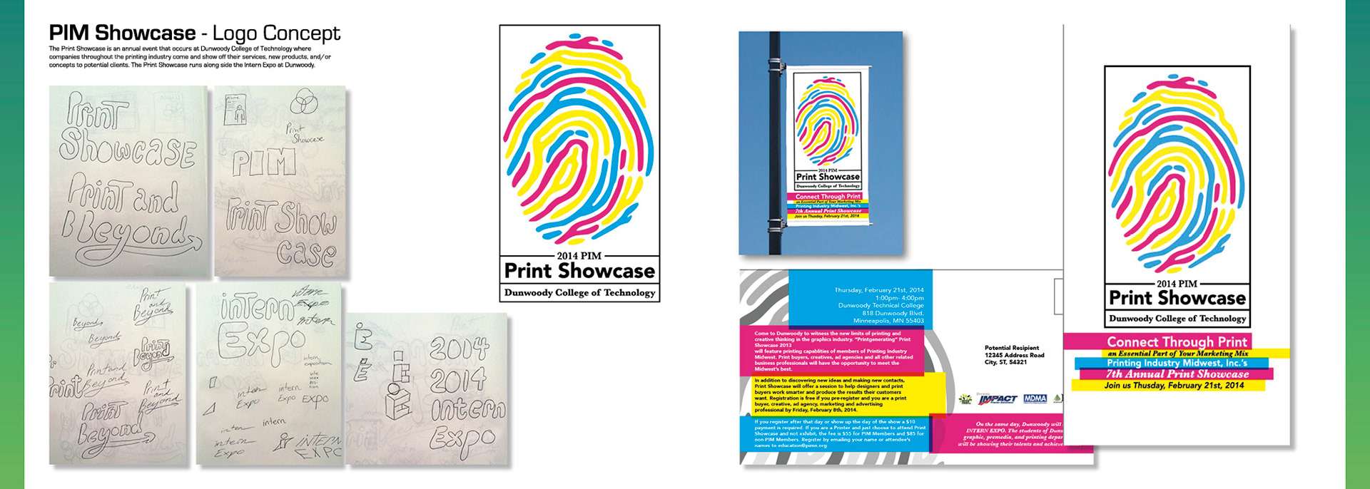
This is the PIM Print Showcase spread for the portfolio. To check out this piece online, click here.
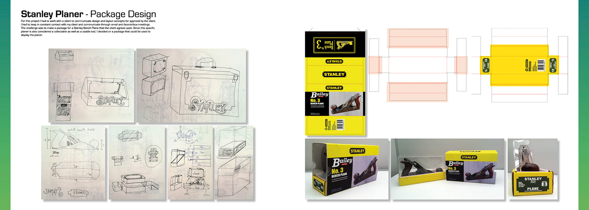
This is the Stanley Planer Package spread for the portfolio. To check out this piece online, click here.
Thank You for Checking Out My Personal Identity Package!
Don't forget to leave feedback, and if you liked what you saw please appreciate!
If you'd like to see more of my work please follow!